The 2012 Horizon Interactive Awards has created a special award called the “Best Use of Typography” as a way to highlight the importance that well designed and executed typefaces have the overall aesthetics of a website. At the HIA, we are interested in the various trends in type design, creators of typefaces and the discussion about how type plays a vital role in overall design.
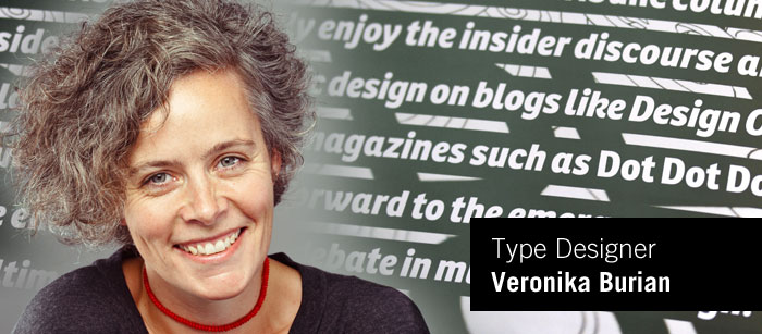
Today, we're speaking with Veronika Burian, a typeface artist and creator from type-together.com located in the Czech Republic. Veronika and her partner José Scaglione launched the type-together.com independent type foundry.
Veronika, thank you for taking the time to talk with us!
VERONIKA: Thank you for having me
HIA: Tell us about your background (experience / education / etc.)
VERONIKA:
I was born in Prague/Czech Republic, but left with my family when I was 7 years old. I grew up in Munich/Germany where i studied Industrial Design. Later on i worked in Vienna and Milan developing various consumer goods. However, i wasn’t very happy with my profession and moved more and more towards graphic design and later typography. Type design became a passion which i wanted to put on firm ground and so i decided to enroll in the MA in Type Design at the University of Reading in the UK. After the one year, I started to work with DaltonMaag, a then small design company that focused solely on corporate typefaces. It was a very good experience for me, but i was sure i wanted to have my own foundry. So a few years after the MA, i got together with José Scaglione, a fellow student from Reading, and we started TypeTogether.
HIA: Tell us about your working environment... do you work in an office, coffee shop, studio, etc.
VERONIKA:
I have a small studio at home and hold meetings in a nice coffee shop around the corner, if necessary. TypeTogether is a virtual studio really. José lives in Argentina and our collaborators and designers are spread out throughout the world. We only meet a couple of times in the year, if at all. The rest of the communications happens on skype or via email.
 HIA: So tell us how you got started with creating type.
VERONIKA:
I think it might have started already quite early on, when i was in school and we started to learn how to read and write. To help us do that we had a so-called "Lesekasten", practically a typesetting box for children. Letters were printed individually on small stripes of plastic which we then used to compose words. I remember it to be a lot of fun. Later on i also wrote my final art project in school about the history of writing. However, my real involvement into type design started much later, when i was working as product designer in Milan. Becoming more and more disillusioned with the reality of product design, my interests shifted increasingly towards typography. A friend, who is a type enthusiast, introduced me then to the world of type design. I knew i found something i really enjoyed and felt at home with. My decision to focus more exclusively on type design developed naturally, amongst others through the collaboration with Leftloft for the exhibition Italic 1.0 at AtypI in Rome and my involvement in teaching at the Politecnico of Milan. Encountering type design was like falling in love. Robert Bringhursts' book "Elements of typographic style" became my inspiration and i decided to change careers and do the MA in type design in Reading, UK.
HIA: Why did you decide to start your website type-together.com
VERONIKA:
I was keen to be independent and create my own type ideas without having to make concessions to clients, and without having to base my design decisions on the fonts’ commercial potential.
HIA: Give us some background about the type-together website and the various designers you work with.
 VERONIKA:
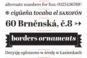
We started quite slowly with a couple of typefaces to find out if we can collaborate. It is often said, that type designers are lonely wolfs that won’t let anybody touch their curves. Well, with José we established a very well working relationship and once we dedicated all of our time to the foundry, we could see good results. In 2008 we had our friends Leftloft from Milan do a redesign of the website and have been improving it, adding new features and information ever since.
Given that we had only a couple of typefaces to begin with, we asked our classmates from Reading if they would like to publish their fonts with us. Most of them said yes. However, we underestimated the time it would take us to finalise and produce those typefaces. So in the end, only a couple were published in the same year. Nevertheless, we continued to publish typefaces, that we liked by other designers and steadily grew our font library, counting 25 by today.
HIA: What do you feel are the most important aspects to type?
VERONIKA:
Quality of drawing; consistency of the design, that manifests itself in repeating details and features; functionality in respect to the reader; originality in exploring ideas.
HIA: Where do you turn for inspiration?
VERONIKA:
Inspiration can be anything, a sign, book, lettering, graffiti, handwriting, old specimens, vernaculars, etc. Ideas depend on the circumstances of the project, but it can be driven by commercial need and interest, personal interpretation of historic models or some interesting lettering. In any case, the idea is also shaped by the purpose of use and the requirements that follow from this, e.g. the design concept for a newspaper font will look very different from a font for onscreen use.
 HIA: What challenges do you face when creating a typestyle.
VERONIKA:
It depends a bit on the circumstances. If it is a tailored project, then the challenges relate to the clients’ expectations, requirements, deadlines. If it is a personal project, then one of the main challenges is long-lasting originality of the design. For me type design is not re-inventing the wheel, but to balance the fine subtleties of shapes in an unexpected way.
HIA: Can you talk about type in relation to overall graphic design?
VERONIKA:
A typeface is the smallest unit with the biggest impact in the system called graphic design. Design is not art. It has a clear purpose and function, namely communication and transfer of information. It involves, to a great extent, written language. In contemporary design, this is mostly done with mechanized writing, i.e. typography. Understanding how type acts is a requirement for those designers who want to excel in their profession.
 HIA: Do you offer hosted web versions of your fonts and where are they available?
VERONIKA:
Yes, we do collaborate with Typekit, Fontdeck and WebInk. Fonts.com also has some of our webfonts. We also offer self-hosting solutions on individual customer-basis when the website has more than 2 mio pageviews per month.
HIA: In terms of overall graphic design and composition, do you have any rules for the variations of type, quantity of faces, etc?
VERONIKA:
I don’t think it’s possible to generalise such statement. Type is very flexible. That is the beauty about it, and selecting a typeface for a particular project should be a cognitive process. The designer needs to think about content and application; who will read it, what is the emotional message, how will the typeface be used, etc. One good basic rule of thumb is, having a few typefaces is always better than using too many.
HIA: What trends do you see in type design?
VERONIKA:
Hybridization of design styles. The classic type categories don’t really apply anymore.
Veronika, thank you again for taking the time to be a part of our developer spotlight. We have enjoyed sharing more information about you and your website. Best of luck to you now and down the road!