There is an old adage that says “the best way to predict the future is to study the past.” This holds true even in this day and age of modern web design. When I created the Horizon Interactive Awards competition some 14 years ago, I had no idea the profound changes in web design that I would see as the competition continued to grow and evaluate the growing number of entries from year to year. Because of the competition’s 14 year history, we sit in a unique position to talk about how web sites have evolved in nearly a decade and a half and to share some predictions as to where they are going in the future.
When the competition was founded in 2001, I was working as a lead web designer at a medium sized technology company in the heart of downtown Indianapolis. While it was certainly not the mecca for cutting edge design trends at the time, we held our own with a client list that included major sports teams, Fortune 500 companies and local government organizations. While many of the web site designs that I was working on were considered to be more mainstream, I found myself fascinated with more experimental web designs that were coming out of Europe. Those sites were interesting to me because they considered "art" first before the technology. While they didn’t primarily serve a business purpose, they were just plain pretty to look at.
Back then, it seemed that the best way to create a “ground-breaking” web site was to open Photoshop, create an interface, and slice up the file using guides and the marquee tool. That was even before Photoshop added the “slices” tool. The only trick was making the design and grid structure work with set of table rows and columns. Sometimes we even used transparent, single pixel spacers to make the table cells respect the layout and as a hack for browser rendering differences. This was all we knew. Don’t judge!
Worse yet, many companies viewed their website as an extension of their print collateral. They simply converted the print piece to HTML and posted it online without considering the audience and and how the medium could work for them in ways that a print piece couldn’t.
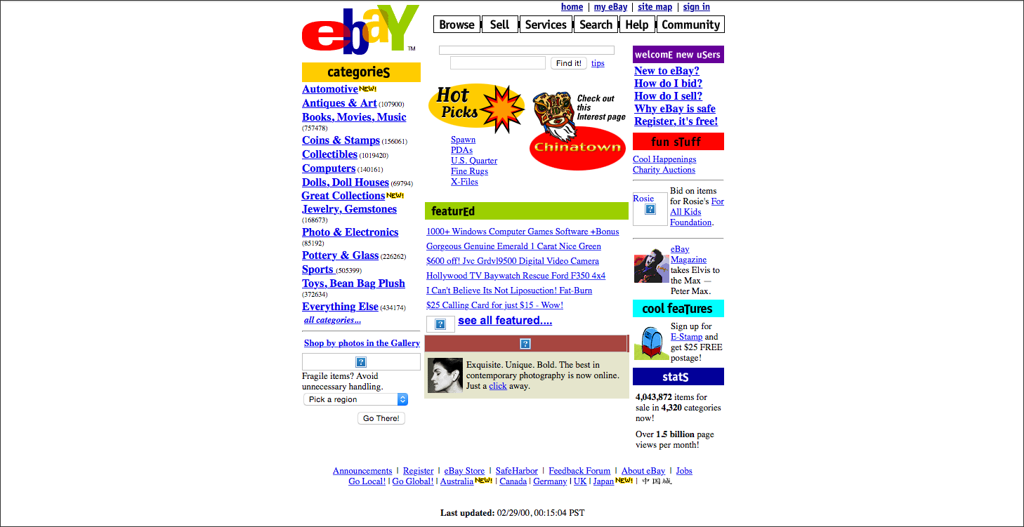
The first Horizon Interactive Awards competition in 2001, focused almost entirely on the “art” aspect of a website that was entered. Judges were “wowed” by sites that seemed to break the mold on the standard textured repeating backgrounds, square bordered text areas and the default blue and purple links. Even sites that had rollover graphical navigation were considered advanced design. Yes... these were the days of IE5, IE6, Netscape Navigator and the horrid FrontPage tool. Those who coded with Notepad were akin to the hippie rock climbing revolution in the 60‘s... rebels. Thank goodness that we have evolved from those days.
I’m not exactly sure when the shift happened but there was a period of 5-7 years where fully immersive Flash websites were certainly on the cutting edge. For the first time, a site could go full screen, use sound and have some animation to convey a mood or elicit some kind of emotion. As soon as clients saw one of their competitors using Flash and having their logo fly onto the screen, everyone wanted to have a Flash site. Even Flash evolved to include advanced scripting and add embedded video. While Flash has become non-existent as an interface and is officially dead, it did pave the way to help shape and define the path that we are on today where many different types of media are converged into a single online experience. In fact, the Horizon Interactive Awards even had a dedicated Flash category to highlight all of the amazing things that designers could dream up to use this web tool. For a long period of time, it was the most entered category from year to year.
Fast forward to 2015.
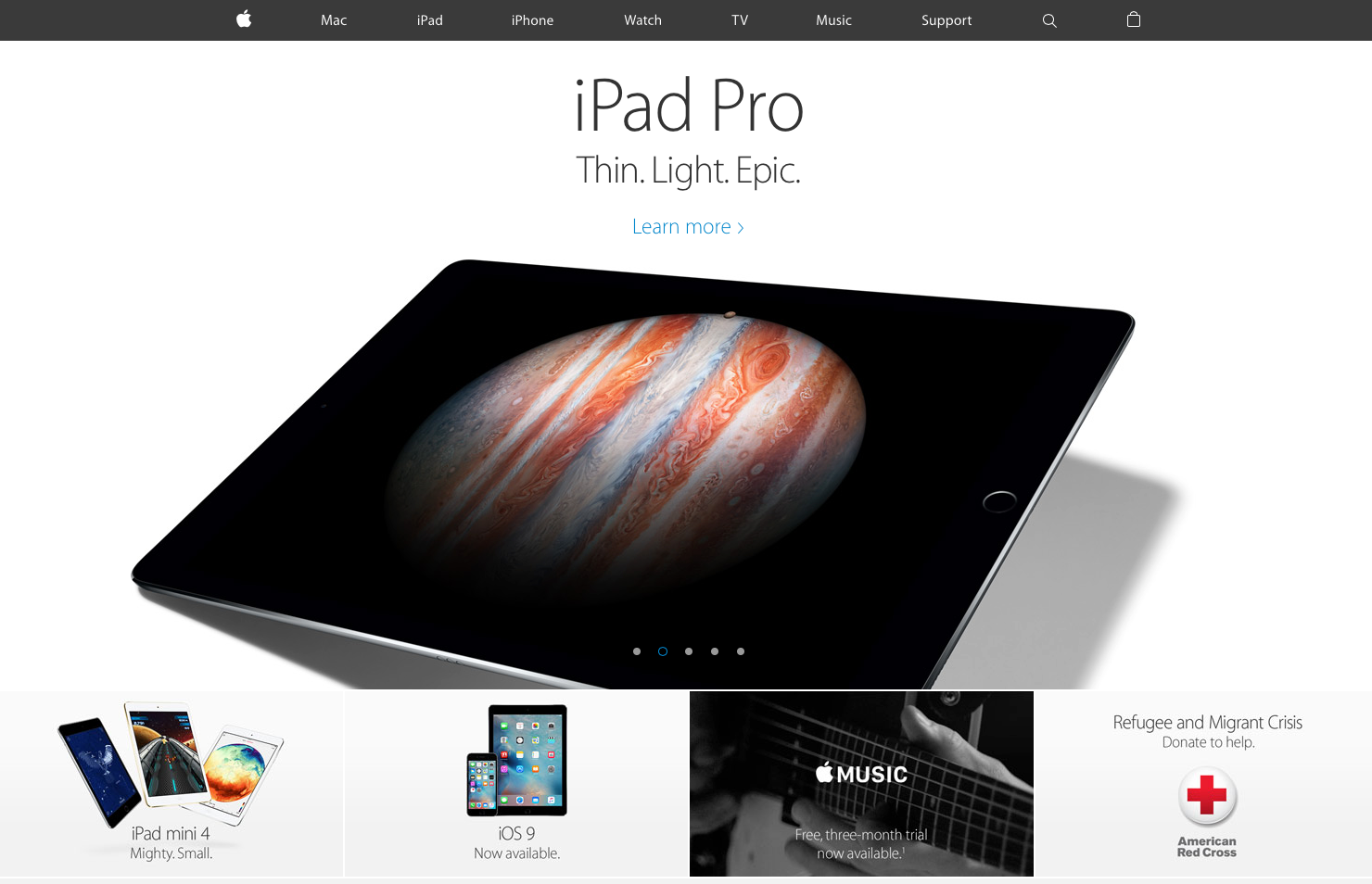
We have come a long way from those days. We have seen the convergence of all kinds of media into a single web experience that can be viewed on a multitude of devices and browser resolutions through responsive frameworks, HTML5 and advanced CSS. Design has become more flat, more about purpose and less about using various Photoshop effects to create the wow factor. Most websites are fully responsive and contextually aware of what environment a user will be viewing the site in and thus tailoring the experience to match by adding or removing features to match. Even marketing and communication teams have a pretty good grasp on how to synchronize company messages and content to create cohesive brands across web sites, traditional print media and social media. Leading companies have found ways to utilize each medium to capitalize on the strengths each one can afford. The modern web seems like a pretty good place to be.
But where are we going?
Responsive design is a new baseline: Responsive design is probably one of the most important shifts in the last 2 years for web designers. We will see a growing number of sites converting and updating to a multi-screen resolution / multi-device framework. This will be the baseline standard for any web site project and the effectiveness of the overall code structures will continue to only get better.
An emphasis on solid User Experience design: There has been a large paradigm shift in many companies where overall UX design and a strong user centered design process has begun to take a driver’s seat on many web site projects. Gone are the days of simply being able to build and maintain a website. Thankfully, companies have begun to understand that delivering a great web site means that they must fully understand their user and why they do what they do.
Geo-aware and context based content: Web sites are currently being programmed to attempt to geo-locate a user. By identifying the user’s location information, content can be dynamically served up that is the most contextually relevant to a user. It’s a great step. Relevancy of information is key to captivating a generation of users who have VERY short attention spans. Sites that remember and try to anticipate your browsing preferences, albeit sometimes in a creepy way, become more of a personalized and trusted tool for a user.
Mobile apps will dominate the design world: Web sites will eventually take a back seat, if they haven’t already, to the mobile experience. Users will gradually opt for a single, go-to device for doing everything from reading the news to booking an airline ticket and even buying a pair of shoes at 1am. Designers will have to shift their focus to design more efficient and elegant mobile experiences for tablet and mobile devices and then consider the desktop site if any at all. Another key challenge for the future will be to maintain brand consistency across the myriad of devices.
Pushing the envelope while standardizing: One of the biggest challenges for designers will be to continue to create engaging and UNIQUE experiences utilizing consistent and predictable design elements. We already see some of this today with the use of a “hamburger” style menu even on desktop resolution websites which indicates that mobile design has begun to converge with desktop design.
While no one can say for sure what will happen in the coming years to web design in general, I am excited to see what the 2015 Horizon Interactive Awards competition winners will show us about about where the future of web design is going.
About the Horizon Interactive Awards